Designing Booz Mobility: Simplifying Electric Scooter Rentals
Designed an Android app that simplifies electric scooter rentals, allowing users to find nearby scooters, unlock them, track rides, and complete rentals through a simple mobile experience.
Overview
Booz Mobility is an electric scooter rental platform designed to make short distance travel easier across corporate campuses, business parks, and public spaces. The Android app allows users to find nearby scooters, unlock them using QR codes, track their rides, and complete rentals through a simple mobile experience.
As the freelance designer, I was responsible for designing the app from scratch, turning the founder’s vision into a practical product. My focus was to simplify the rental journey, make scooter access faster, and guide users through safe riding and designated parking.
Designing a scooter rental app meant solving more than just the booking process. Users needed to find and unlock scooters quickly, understand where they could ride, and park them at approved locations. The experience also had to work reliably in outdoor environments where GPS accuracy and network connectivity could be limited.
I designed a simple, guided rental experience that helped users find nearby scooters, unlock them through QR codes, and track their rides in real time. I also focused on clear parking instructions, location awareness, and a straightforward ride completion process to reduce confusion and make scooter rentals easier to manage.
Project Discovery
In 2018, I was approached by Rutvij, the founder of Booz Mobility, to design an Android app for his electric scooter rental startup. We met at their office, where he explained the business concept, target audience, and vision for the product.
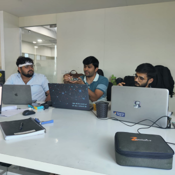
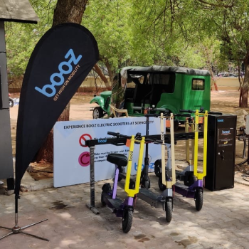
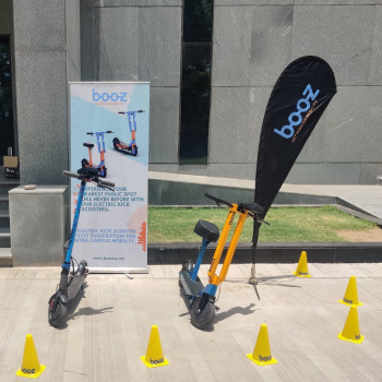
During our meeting, the team also gave me a demonstration of their electric scooter, helping me understand the physical product and how users would interact with it. The goal was to make short distance travel easier for university students and staff, as well as people visiting public spaces and exhibitions.
After understanding the concept and the product, I began exploring the market to identify existing solutions, understand potential user challenges, and define the foundation for the app.
Market Research
At the time, electric scooter rental apps were still a new concept in India. I researched existing solutions to understand how competitors handled scooter discovery, unlocking, ride tracking, and parking. Although similar services existed in international markets, there were very few competitors, and none were operating in India.
My research focused on identifying useful design patterns and understanding how this model could work for the Indian market. I explored potential challenges around finding scooters, understanding where users could ride and park, and making the rental process simple for first time users. These insights helped me define the key areas to focus on before moving into user personas and information architecture.
User Research
Since the product was new to the Indian market, I had limited existing user data to work with. I created hypothetical user personas based on the target audience and my market research to understand their needs, goals, and potential challenges.
I focused on two primary user groups: university students and staff who needed a convenient way to travel across large campuses, and visitors to public spaces and exhibitions who wanted an easy way to explore larger areas. These personas helped me identify potential pain points and make informed design decisions before moving into the information architecture and user flows.
Amit Sharma - Software Engineer

Amit Sharma
Software Engineer at a massive IT park
Goals
- Reach meetings on time.
- Find a nearby scooter quickly.
- Enjoy smooth, hassle-free ride.
Pain Points
- Walking between buildings takes too long.
- Public transport is inconvenient.
- Scooter rental and unlocking can be confusing.
“I just want a quick, reliable ride to my next meeting without wasting time."
User Story
As a software engineer working in a large IT park, I want to quickly find and unlock a nearby scooter so that I can travel between buildings and reach my meetings on time without wasting time walking.
Neha Bhagat - Tourist

Neha Bhagat
Tourist visiting the Sabarmati Riverfront
Goals
- Have a fun day out with friends.
- Explore the area easily.
- Stay within budget.
Pain Points
- Not familiar with areas and parking rules.
- Concerned about safety while riding.
- Worried about unexpected cost.
“I want a fun, safe ride with friends without worrying about costs or parking rules."
User Story
As a tourist exploring the Sabarmati Riverfront with friends, I want to rent a scooter easily and understand the riding and parking rules so that I can enjoy a safe, affordable ride without confusion.
Key Research Insights
Quick Scooter Access
Users need to find and unlock nearby scooters quickly, especially when travelling between buildings.
Clear Parking Guidance
Users need clear riding boundaries and designated parking locations to avoid confusion and incorrect parking.
Simple Rental Experience
First time users need a straightforward process to find, unlock, ride, and return scooters without confusion.
Product Goal
The goal was to design an easy to use scooter rental app that meets the business needs of Booz Mobility while providing a smooth experience for users. The focus was on simplifying scooter rentals, encouraging responsible parking, and making short distance travel convenient across campuses and public spaces.
User Goals
- • Find and unlock nearby scooters with minimal effort.
- • Understand riding zones and designated parking areas.
- • Track rides and complete rentals with confidence.
Business Goals
- • Make scooter rentals simple and accessible to more users.
- • Reduce parking issues with designated parking zones.
- • SSupport rentals across campuses and public spaces.
Information Architecture
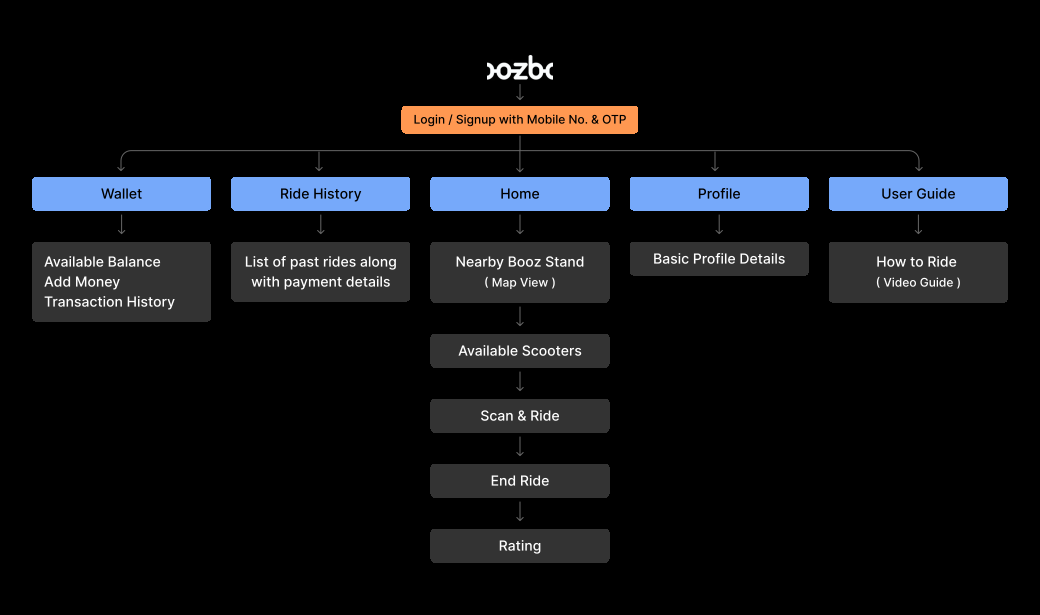
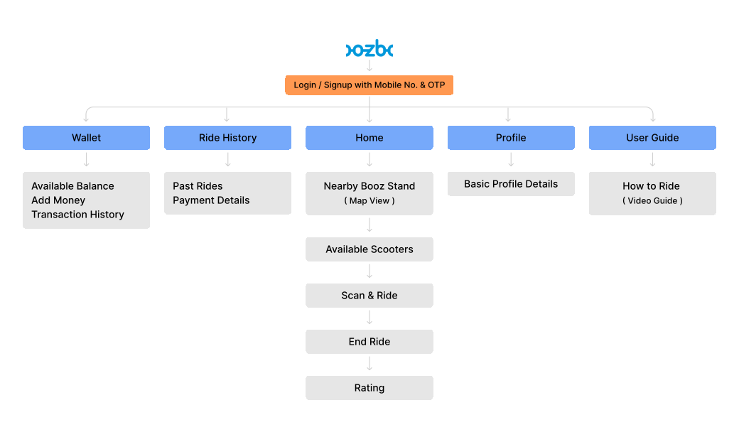
With the key user needs and product goals defined, I structured the app’s information architecture to make navigation simple and predictable. I organized the core features around the rental journey, helping users find scooters, manage rides, track payments, and access their account without unnecessary steps. This structure became the foundation for the user flows and wireframes, ensuring the app remained easy to navigate for both first time and returning users.
User Flows
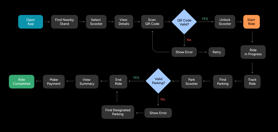
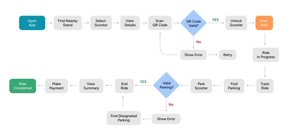
With the information architecture finalized, I mapped out the key user journeys to understand how users would interact with the app from start to finish. I focused on two main flows: finding and unlocking a scooter to start a ride, and tracking the ride through parking and completion. This helped me establish a clear, straightforward journey with minimal steps and clear guidance at each stage.
Lo-fi Wireframes
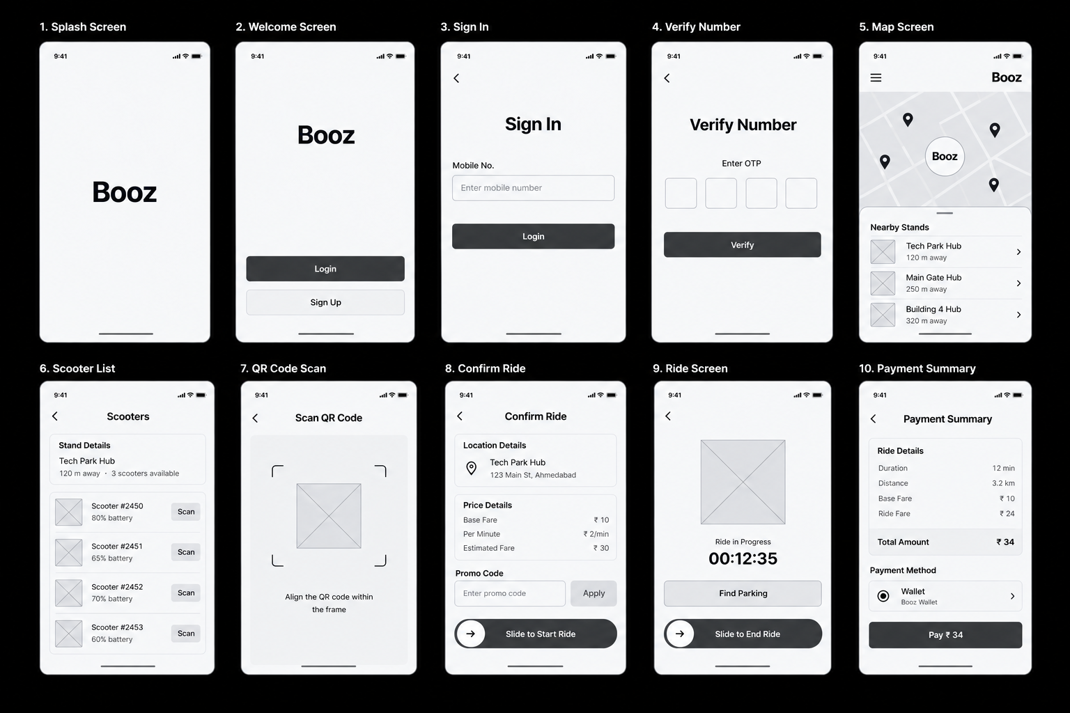
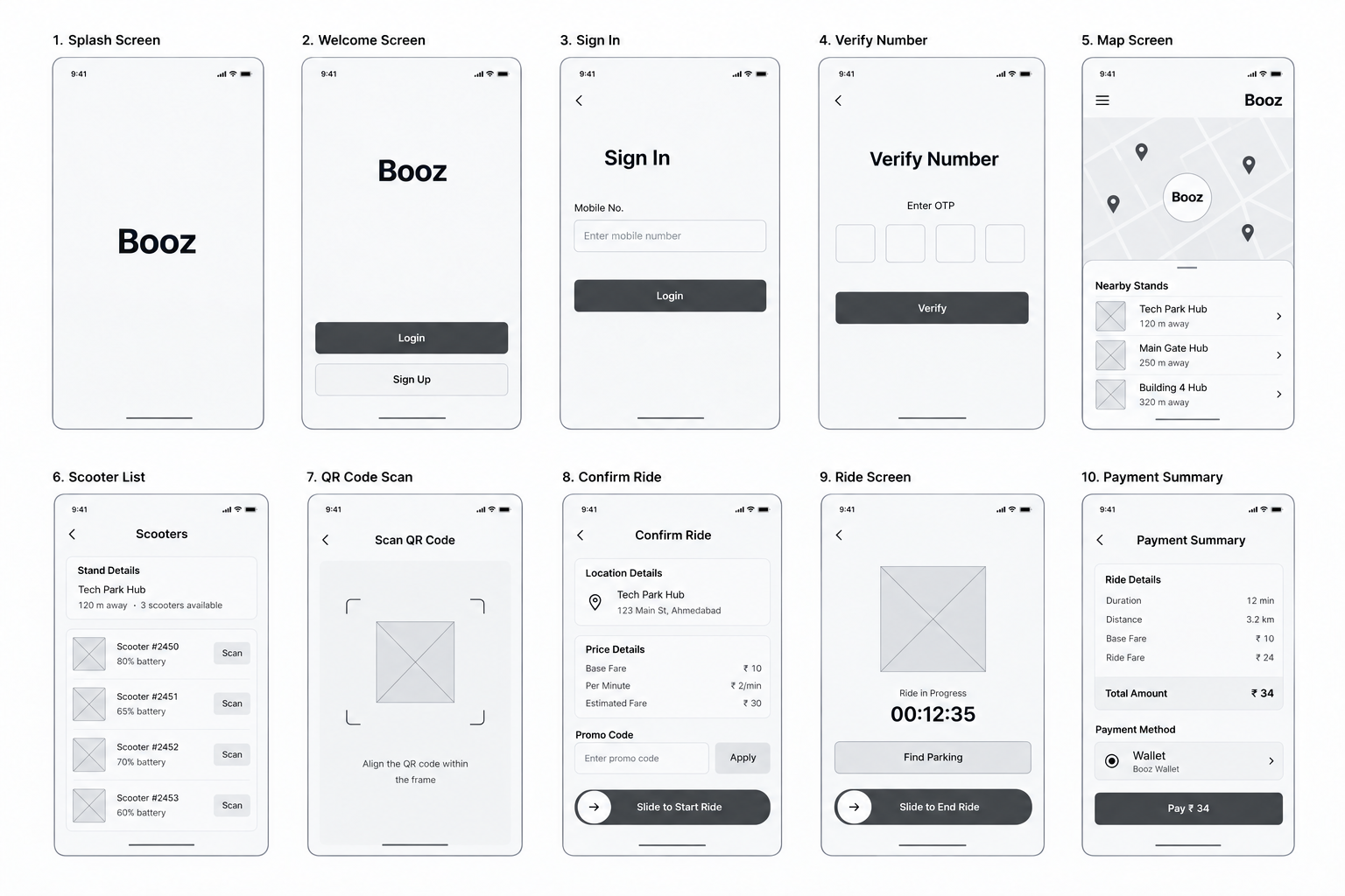
With the user flows defined, I started creating low fidelity wireframes to establish the layout, structure, and functionality of each screen. I focused on simplifying key interactions, from finding nearby scooters and viewing scooter details to tracking rides and completing rentals. I shared the initial wireframes with the founders to gather feedback and align the design with their vision. Based on our discussions, I refined the layouts and finalized the screen structure before moving into the visual design phase.
Final Designs
After the founders approved the wireframes, I moved directly into designing the final UI mockups in Photoshop. My focus was to translate the approved layouts into a clear, intuitive mobile experience that simplified scooter rentals, helped users make quick decisions, and guided them through every stage of their ride.
Login & Signup Flow
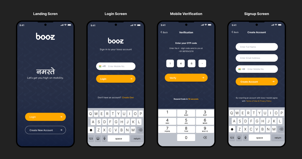
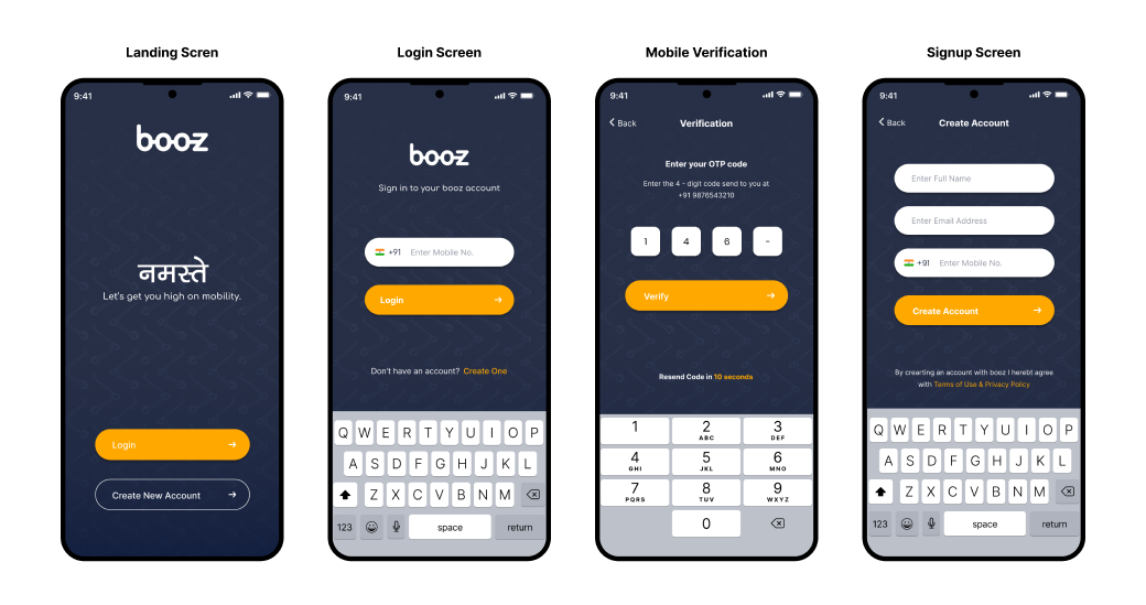
I designed a straightforward onboarding flow that allows users to create an account or sign in using their mobile number and OTP verification. The goal was to minimize friction during registration and help users access the app quickly without unnecessary steps.
App Navigation
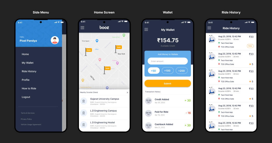
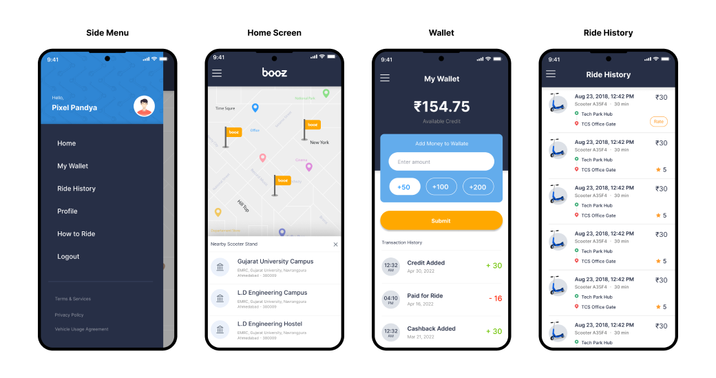
I structured the app navigation to help users access essential features, including nearby scooter stands, available scooters, ride history, wallet, and profile settings. The layout keeps key information easy to find and makes common actions accessible throughout the rental experience.
Ride Experience
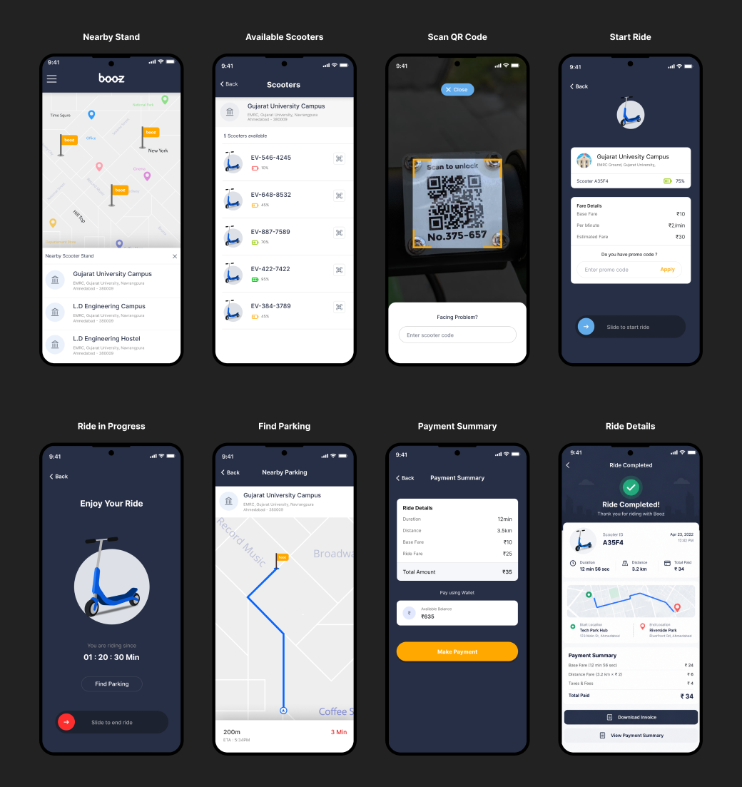
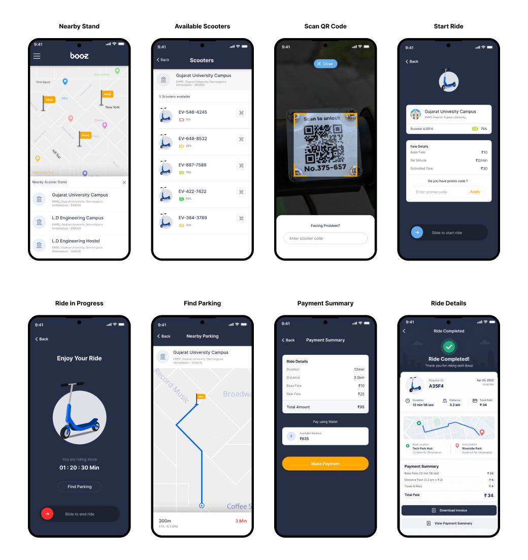
I designed the complete ride journey, from selecting a scooter and scanning its QR code to starting, tracking, and ending a ride. I also included ride confirmation, fare details, parking guidance, and a completion summary with payment information, helping users understand each step and complete their rental with confidence.
Usability Test
After completing the initial designs, I reviewed the key user journeys to identify potential usability issues and areas for improvement. I focused on three critical areas: scooter discovery and selection, ride initiation and confirmation, and ride completion and parking.
This review helped me identify opportunities to simplify scooter selection, make the QR scanning and ride confirmation process clearer, and improve parking guidance and payment summaries. These iterations aimed to make the rental journey more intuitive and help users complete each step with less confusion.
Key Design Iterations
Scooter Discovery & Selection
Simplified how users find nearby scooter stands, check scooter availability, and choose a scooter before starting their ride.
Ride Initiation & Confirmation
Clarified the QR scanning and ride confirmation steps, making scooter unlocking, location details, and estimated fare easier to understand.
Ride Completion & Parking
Improved the end ride flow by guiding users to designated parking locations and providing clear ride completion and payment summaries.
Project Outome
Booz Mobility later appeared on Shark Tank India, gaining visibility for its electric scooter rental solution and securing ₹40 lakhs in funding. The project gave me the opportunity to design an end to end Android experience that simplified scooter discovery, unlocking, ride tracking, parking, and payment.
₹40 Lakhs Funding Raised
Booz Mobility secured ₹40 lakhs in funding after appearing on Shark Tank India.
Learning
Designing Booz Mobility taught me how to translate a new business concept into a practical mobile experience. With limited competitors in the market, I learned the importance of understanding user needs, simplifying unfamiliar interactions, and creating clear guidance throughout the rental journey. The project reinforced three key learnings:
Understand User Context
Different environments, from corporate campuses to tourist destinations, create different mobility needs. Designing for these contexts helped shape a more relevant user experience.
Simplify Complex Interactions
Making scooter discovery, QR scanning, ride tracking, and parking easy to understand is essential to creating a smooth rental experience.
Design for Real World Usage
Mobile experiences must account for real world situations, including finding available scooters, identifying parking zones, and completing rides without confusion.
Other Case Studies
Redesigning a B2B Review Platform for Growth and Discoverability
Redesigned the review and ratings platform to be more user-friendly and SEO-friendly.
Designing a SaaS Spend Management Platform from the Ground Up
Designed a B2B SaaS platform helping small businesses understand and optimise their SaaS software spend, with workflows for accountants and bookkeepers.