Overview
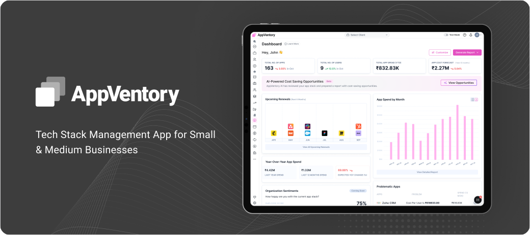
AppVentory is a B2B SaaS spend management platform designed for small businesses, accountants, and
bookkeepers in the US and UK markets. Our founders had extensive experience in the accounting and
bookkeeping industry and had strong connections with professionals who used platforms such as Xero,
QuickBooks, FreshBooks, and other accounting software.
When I joined AppVentory as a Product Designer in early 2024, the product was still just an idea
on
paper.
The founders had already spoken with potential users in the accounting and bookkeeping industry and
conducted user interviews, surveys, and research. They shared the documented findings with me, giving me a
clear understanding of the users, their challenges, and the product vision.
Using this research as the foundation, I started designing the product from the ground up.
Problem Statement
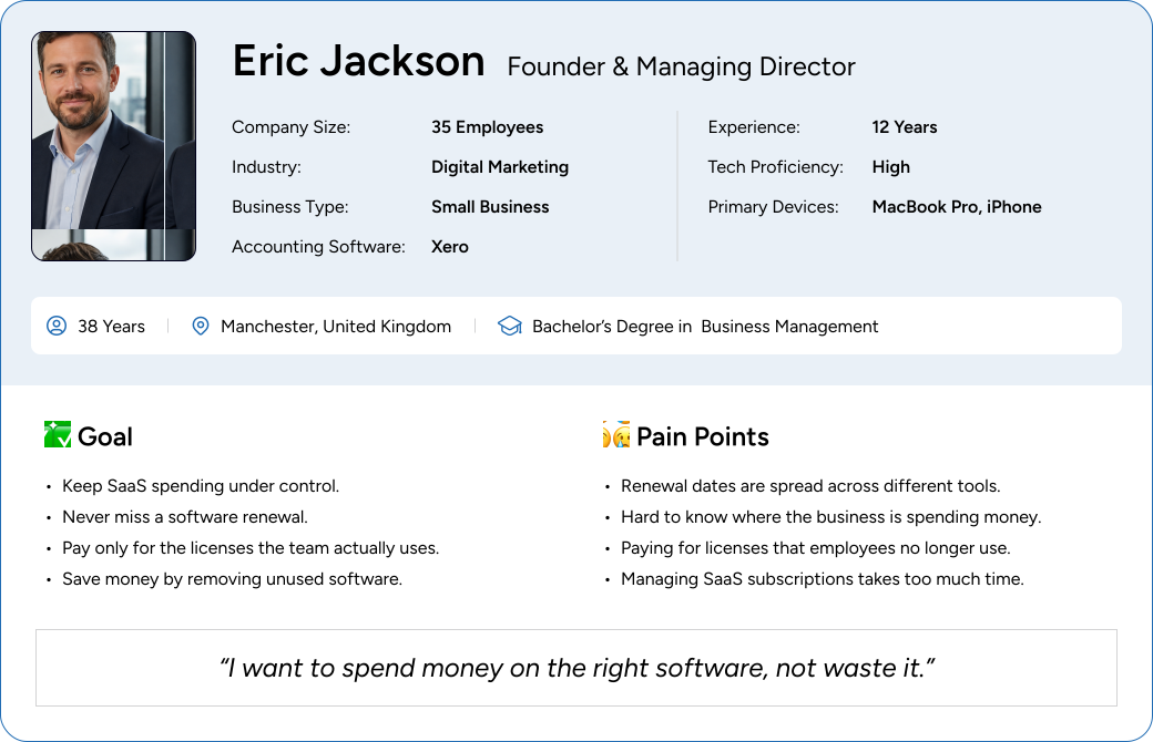
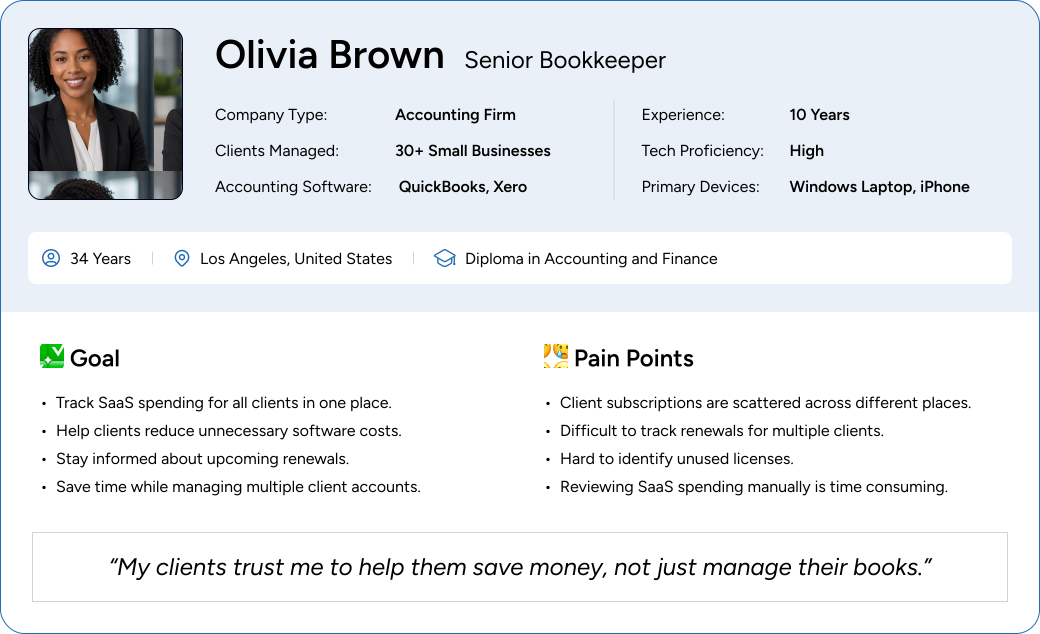
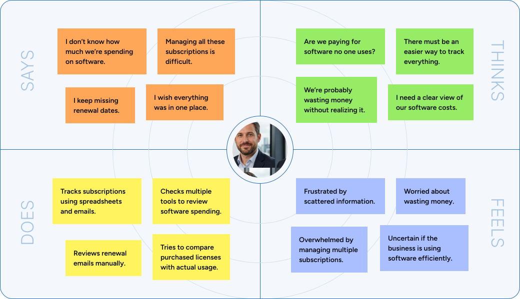
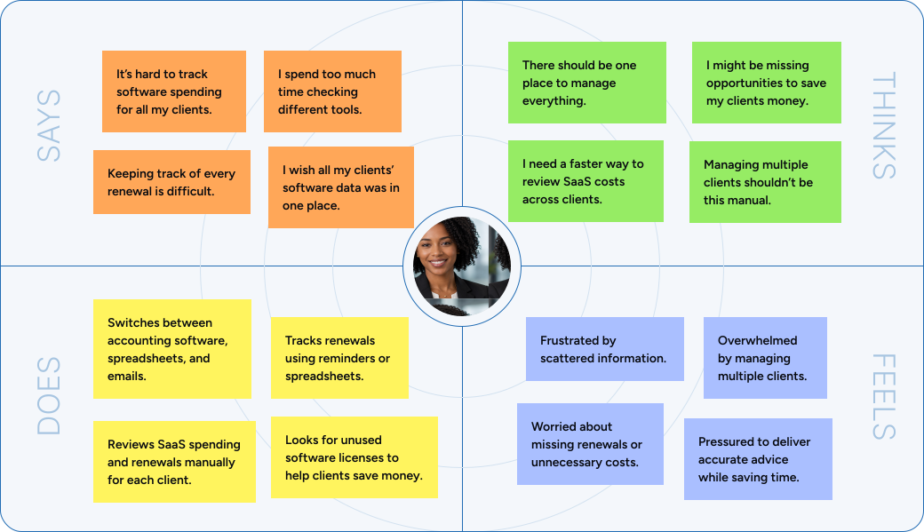
Once I created the user personas to better understand our users’ pain points, I developed empathy maps to
understand their thoughts, feelings, actions, and needs. I then wrote user stories to capture their main
goals and expectations. Based on these insights, I defined three problem statements that addressed the
recurring challenges identified during the research.
I identified three major pain points for users:
Small businesses struggle to track SaaS spending and manage renewals because they use multiple
subscription based tools with different renewal dates. As a result, they have limited visibility
into
software costs and may miss renewals or continue paying for software they no longer need.
Businesses struggle to identify unused software licenses because they don’t have a clear view of
purchased licenses compared to actual usage. As a result, they continue paying for licenses that are
no longer needed, leading to unnecessary software costs.
Accountants and bookkeepers struggle to track SaaS spending, renewals, and software licenses across
multiple client businesses because the information is spread across different tools. As a result,
managing software costs and identifying savings opportunities becomes time consuming and difficult.
Competitor Audit
After identifying the target users and their pain points, I wanted to understand how existing SaaS spend
management platforms approached these challenges. I conducted a competitor audit to study common
workflows,
feature sets, and user experiences. This helped me identify industry best practices as well as
opportunities
where AppVentory could differentiate itself.
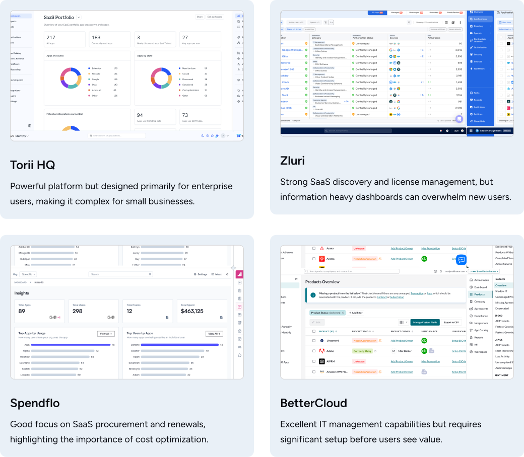
Key Findings
1
Enterprise-first focus
Most competitors target large
enterprise customers, leaving small businesses with overly complex and expensive tools.
2
Cluttered dashboards
Dashboards are often overloaded
with data, making it hard for users to quickly find what matters most.
3
Lengthy onboarding
Users are required to complete
multiple integrations before getting any meaningful value from the platform.
4
Fragmented renewal tracking
Renewal tracking and license
management are spread across different sections, forcing users to context-switch constantly.
5
Opportunity for simplicity
There is a clear gap for a
simpler, focused experience tailored to small businesses and accountants.
Prouct Goal
The insights from the user research and competitor analysis helped me define clear product goals. These
goals became the foundation for prioritizing features and planning the MVP.
- The product goals I defined were:
- Most competitors target enterprise customers rather than small businesses.
- Dashboards are often cluttered with large amounts of data.
- Users usually need to complete multiple integrations before seeing any value.
- Renewal tracking and license management are spread across different sections.
- There was an opportunity to create a simpler experience focused on small businesses and accountants.
Information Architecture
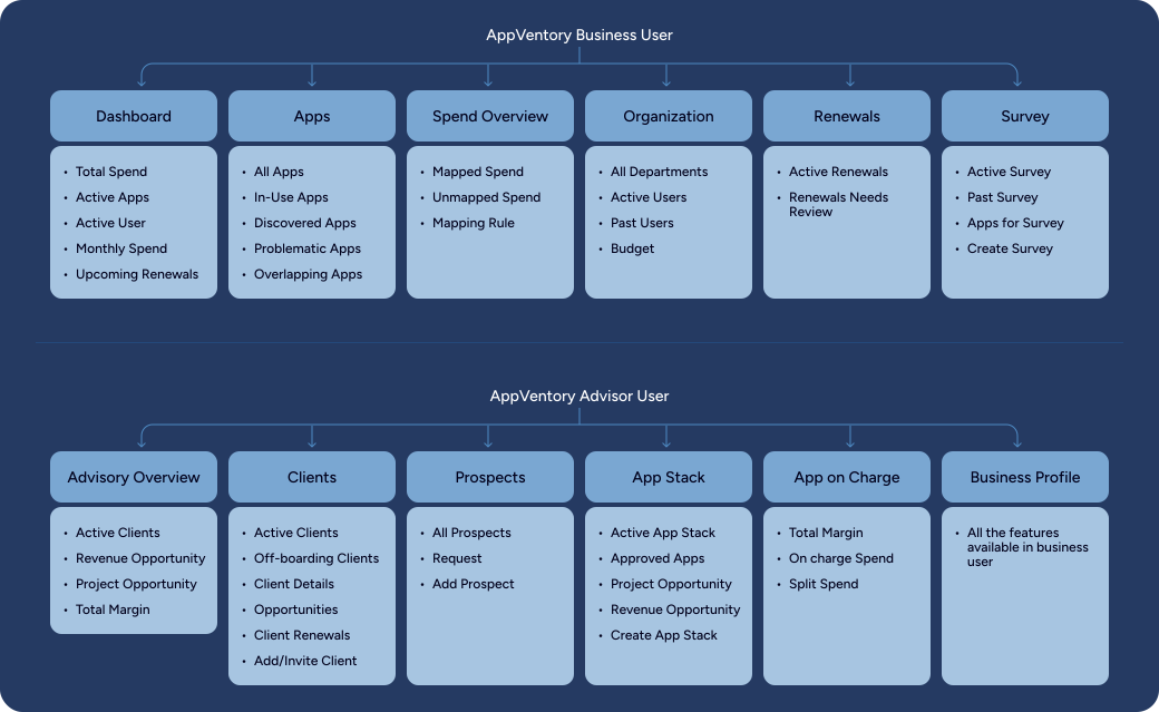
After defining the product goals, we decided to move into the design phase. Before designing individual
screens, I started by creating product’s information architecture. This
helped me organize the product into logical modules, map the key user journeys, and establish a clear
foundation for the overall user experience.
Early Concept Design
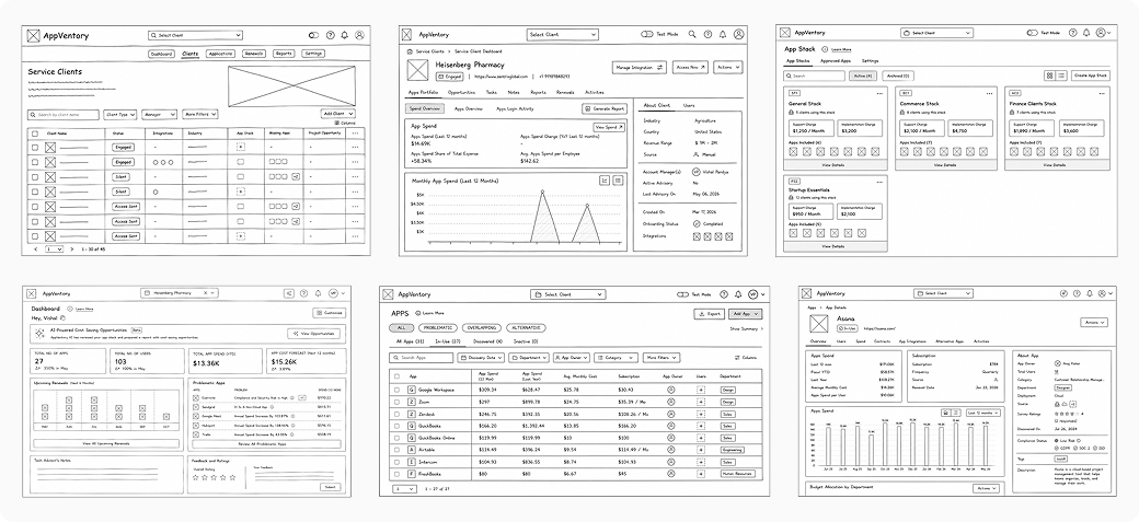
Using the information architecture and user flows as a guide, I created low fidelity wireframes to
validate
the overall product structure and core workflows before moving into visual design. This helped me quickly
explore different layouts, gather feedback from stakeholders, and refine the user experience early in the
design process.
The initial wireframes focused on the product’s key modules, including the Dashboard, Apps, App Details,
Clients, Client Details, and App Stack. These screens helped define the overall navigation, information
hierarchy, and interactions, providing a solid foundation for the high fidelity designs.
Foundation of Design System
After reviewing the low fidelity wireframes with the founders and other stakeholders, we finalized the
core user flows and overall product structure. With the workflows validated, I was ready to move into high
fidelity design.
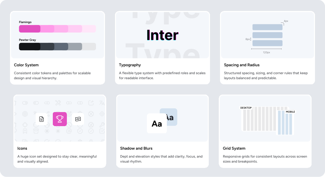
Before designing the final interfaces, I created a scalable design system to establish a consistent visual
language across the product. This gave me a solid foundation for designing new features efficiently while
maintaining consistency throughout the user experience.
Final Solution
With the scalable design system in place, I moved on to designing the final high fidelity screens based on
the
validated wireframes. My focus was on creating a consistent, intuitive, and scalable user experience
across
the entire product.
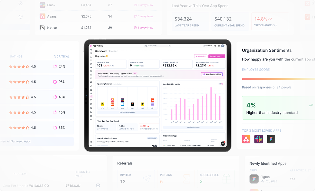
Dashboard
I designed the dashboard to give users a clear overview of their software spending. It highlights key
metrics such as total spend, active users, spend forecast, upcoming renewals, and allows users to analyze
spending by month, app, user, and department.
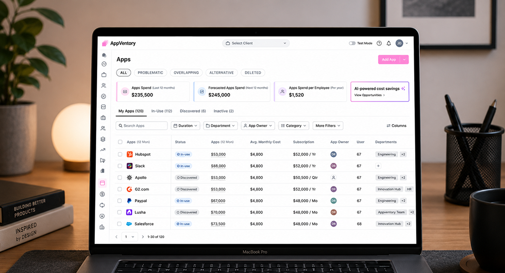
App Listing
The Apps page gives users a complete view of all the software used across their organization. Users can
search, filter, and manage applications, review software spending, identify inactive or discovered apps,
and
quickly access important details such as subscription cost, app owner, users, and departments.
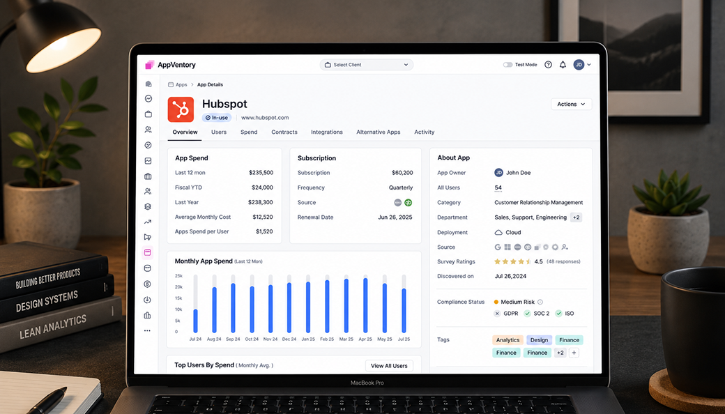
App Details
The App Detail page provides detailed information about a specific application. Users can review software
spending, subscription details, renewal dates, usage trends, integrations, compliance status, app owners,
departments, and other key insights to better understand and manage each application.
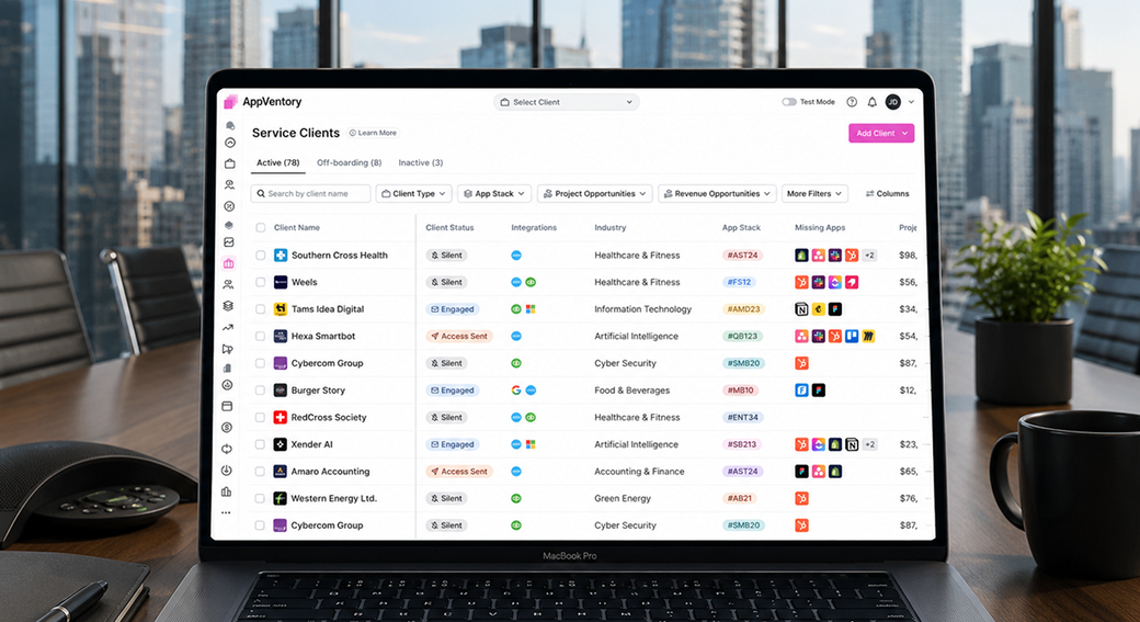
Client Listing
The Clients page allows advisors, accountants, and bookkeepers to manage all their clients from one place.
Users can search and filter clients, view their onboarding status, connected integrations, app stack,
spending opportunities, and quickly access each client’s workspace.
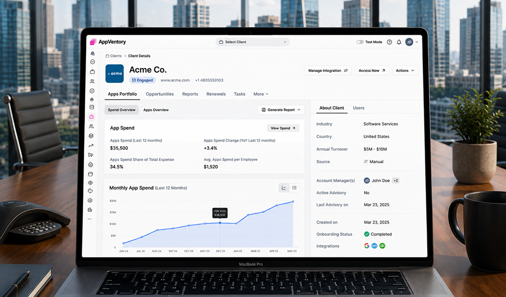
Client Listing
The Client Detail page provides a complete overview of a client’s software environment. Users can review
SaaS spending, app portfolio, renewals, reports, opportunities, tasks, and integrations, along with key
business information to help them manage and optimize software costs for each client.
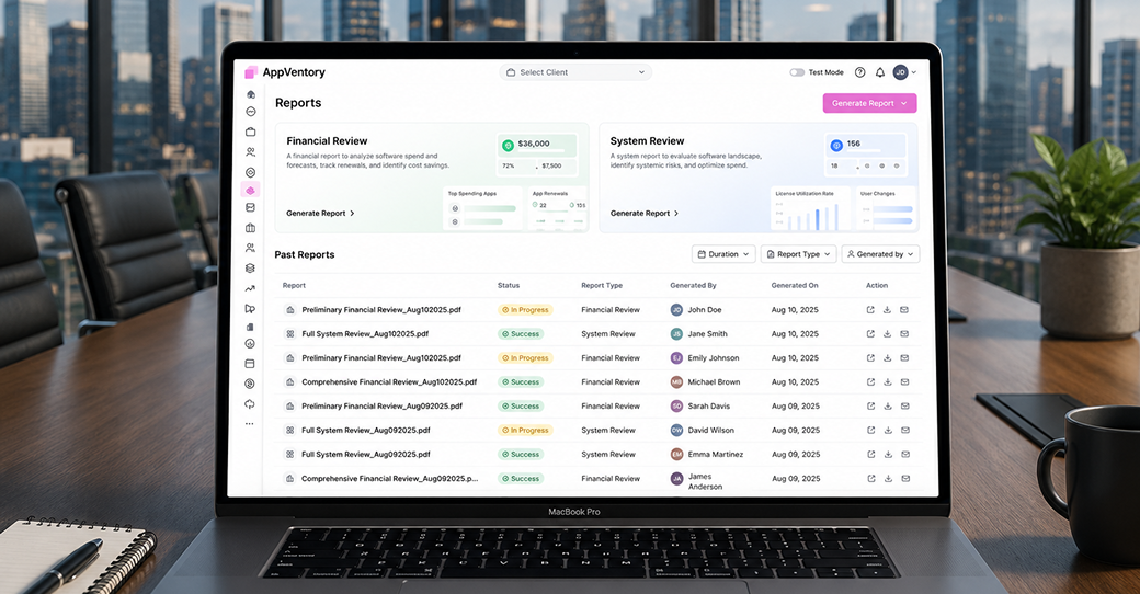
Client Listing
The Reports page allows users to generate and manage software reports from one place. Users can create
financial and system reports, review previously generated reports, track their status, and download or
share
them to gain insights into SaaS spending, renewals, software usage, and cost optimization opportunities.
After the designs were approved, I handed them over to the engineering team for implementation. My role
didn’t
end there. I continued collaborating closely with the engineers throughout development to ensure the final
product was implemented as intended and maintained the quality of the design.
Measurable Impact
Through AppVentory, I designed a single platform where businesses could manage their SaaS apps, software
spending, renewals, and usage in one place. My goal was to make everyday tasks simpler, reduce manual
work,
and create a product that could easily grow as new features were added.
The following outcomes show the impact of the product and how my design decisions helped improve the
overall
user experience.
Key Outcomes
52%
Better spend visibility
41%
Less manual tracking
35%
Faster task completion
68%
Simplified Workflows
Learnings
Working on AppVentory taught me how to design a product from the ground up. I learned how to turn research
into product decisions, balance user needs with business goals, and work closely with founders and
engineers
throughout the product lifecycle. It also strengthened my skills in product thinking, design systems, and
designing scalable B2B SaaS experiences.